Google’s New Search Results Design Puts YOUR Dealership in the Spotlight

The update is on mobile only...for now.
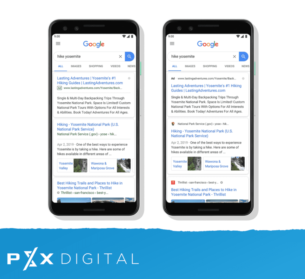
Google released a new look for its mobile search results that feature site branding versus appearing on the page like every other blue link.
Previously, the search results were blue and the source — like a Powersports dealership site, for example — would appear below the source in a smaller green font. Now, the publisher gets top billing! Not only that, but the source will appear on top of the results showcasing the site's own favicon.
What's this mean to you?
If you are a PSXDigital website customer, then we've got you covered.
All of our websites are built with Google Search Console included. This ensures that any updates by the search engine will periodically roll through their mobile-friendly tool and be optimized for performance. Additionally, our team will manually spot check our dealership websites to make sure the logos are showing properly and make any adjustments necessary.
Secondarily, the update impacts how Google Search ads appear as well. Before, the word "Ad" was displayed in a small green box before the source link. Now, the word "Ad" will appear in bold black front in place of the website icon. This makes the sponsorship less noticeable in the top search with the eyes naturally drown down to the blue link.
Why it's worth mentioning
It's a subtle difference, but one that helps your brand stand out. Especially to shoppers already familiar with your dealership. The opportunity to compel the 'tap through' out of personal preference increases and sets your store apart from others. Google hopes it will help searchers better understand the source of the information as being directly from the site, boosting authority over those who are not.
How does this affect the future?
As of now, it doesn't. But while this revamp is coming to mobile first, there's a good chance Google will eventually push it over to desktop, too - paving the road to more advanced updates unveiled at the recent I/O developer conference. This might be the first of many changes we'll soon see!
What more should I know?
For more information about the new design for Google Search, please visit their blog explaining it all HERE.


